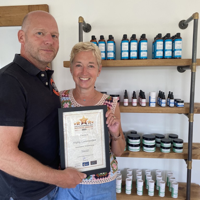
I’m absolutely delighted to be working with the award-winning duo, Gemma and James of Puremess. Their passion for creating beautiful, natural skincare has been the perfect inspiration for developing their brand and promotional graphics.
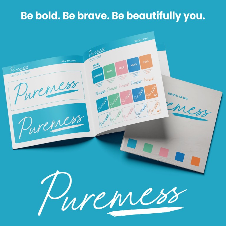
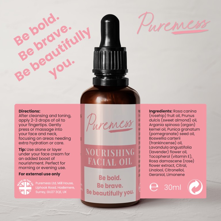
From the moment we started refining their logo and creating the brand guide, it was clear this was going to be a great project to be involved in. We worked closely to create a colour palette that not only reflected their diverse range of products but also captured the personality that runs through their entire business.
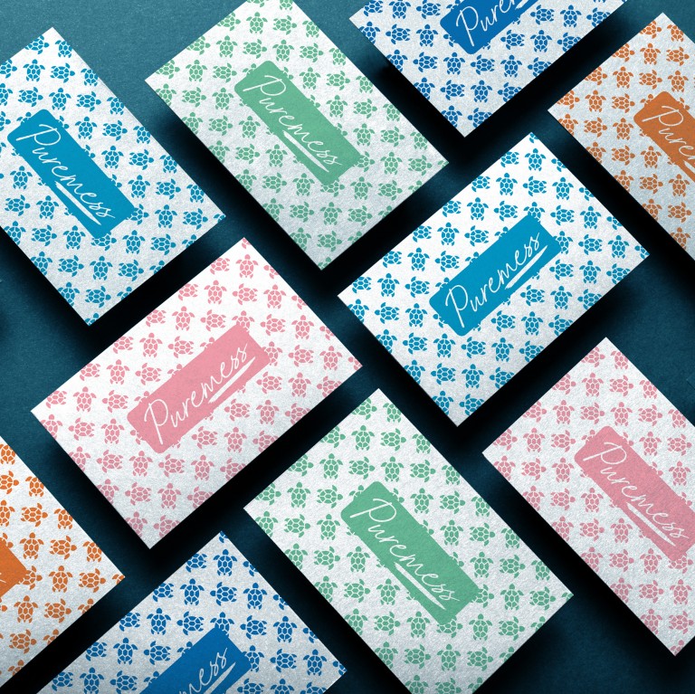
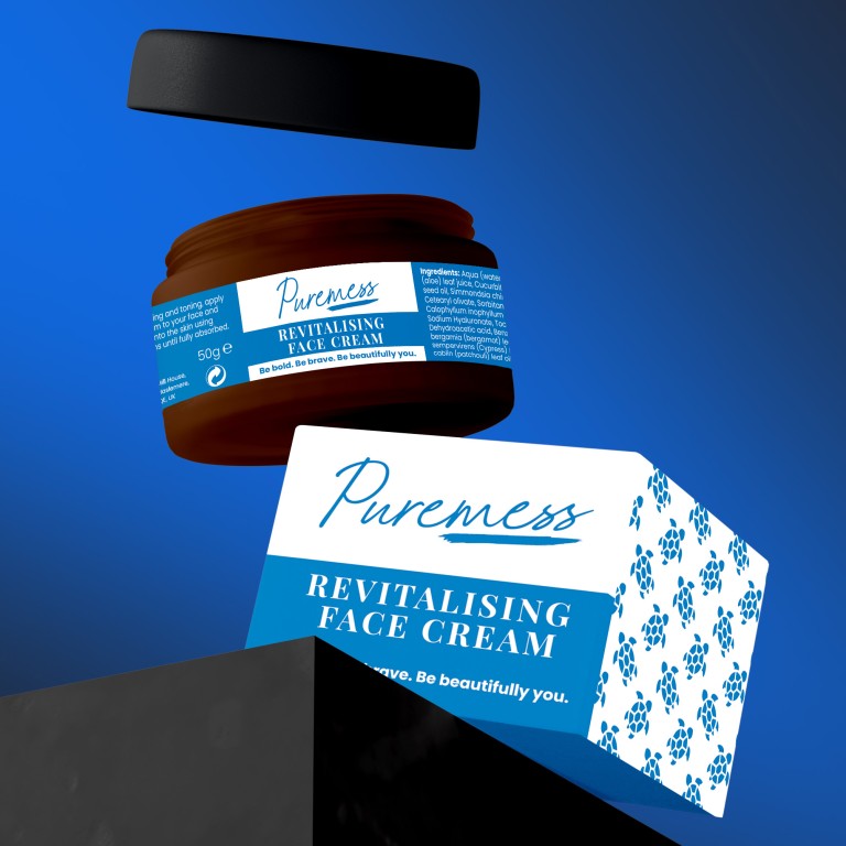
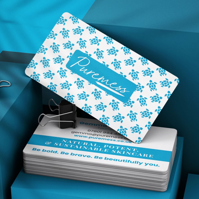
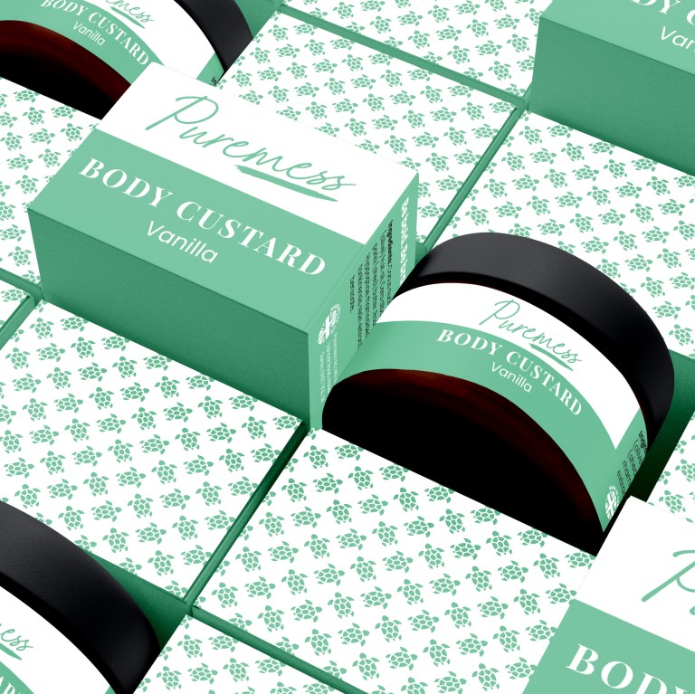
Applying that visual identity to their product labels and packaging was where the brand started to came to life – every detail crafted to echo their commitment to sustainability, quality, and a genuine love for what they do. The turtle icon is very personal to Gemma and reflects their commitment to the environment. Their bottles and jars are made from recyclable PET plastic, giving waste a second life and keeping it out of the oceans.
Puremess has grown from a deeply personal vision into a recognised and respected name in sustainable skincare, and seeing the pride Gemma and James take in their products makes our creative partnership even more rewarding. Collaborating with them has been a journey of ideas, colour, and creativity – all wrapped around a brand that is as honest and inspiring as the people behind it. We’re proud to have played a part in their story, and we can’t wait to see where they take Puremess next.
Have a story to tell about your company... Let's talk!