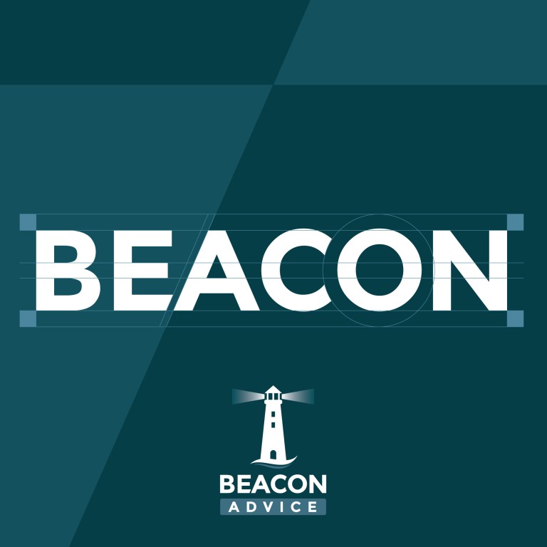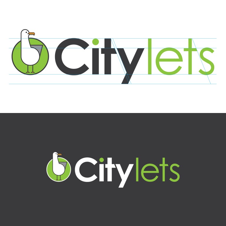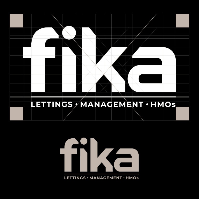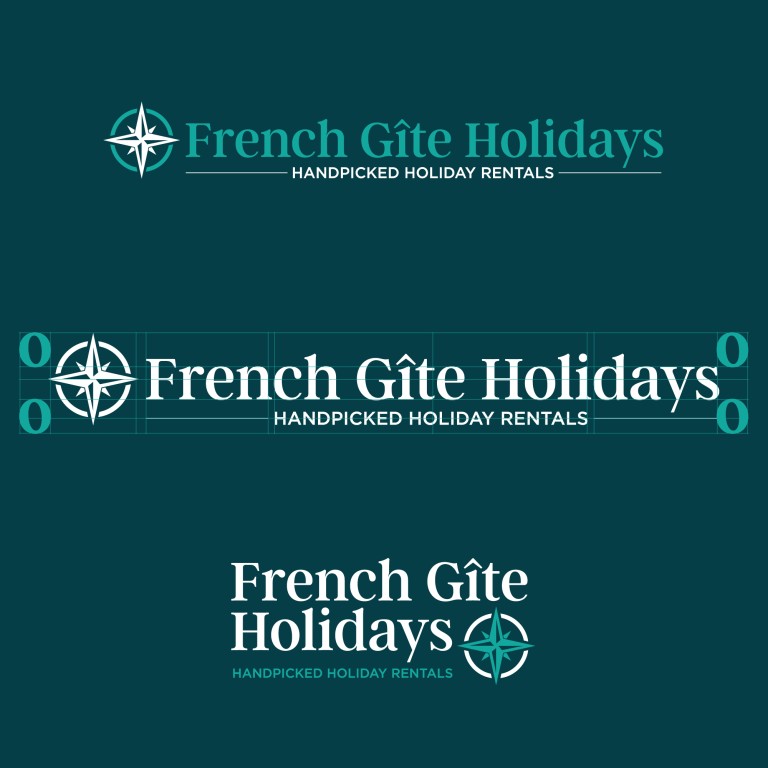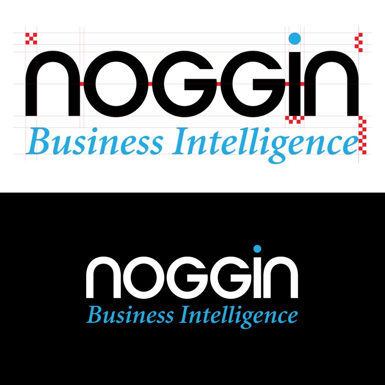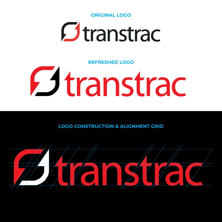
There’s a moment in every branding project when the conversation shifts from “What font is that?” to “How do we make this unique?” And that’s where the craft really begins.
Choosing a typeface is just the starting point. Anyone can type out a company name, nudge it left or right, and call it a logo. But a true logotype — something that becomes recognisable, memorable, unmistakably “your logo” — comes from the small, almost invisible adjustments that elevate simple lettering into a brand asset.
It’s in the angles. The way the alignments echo each other. How a curve from one letter is repeated in the next. Whether a crossbar sits perfectly aligned with a neighbouring shape, or needs to be optically adjusted so the whole word feels balanced. It’s in the spacing. Letters that breathe evenly. Gaps that feel intentional. A rhythm that leads the eye through the name in a smooth, confident line. Sometimes it’s in the editing. A serif trimmed. A tail lifted. A stem widened so it reads better at a distance. A subtle slice, a handmade curve, a bespoke ligature that gives the word its own personality.
These are the tweaks that most people never consciously notice, yet instantly recognise. And it’s why a logotype is never really “just a font” — it’s crafted... considered... designed! We’ve done this countless times for clients... their name is their brand... but only once it’s been shaped, refined and given the care it deserves!
Typography or logotype? In truth, the difference is in the detail. And that’s exactly where the magic happens.
Need a new logo, or your existing logo refreshed and refined... Let’s talk!

