Every so often a brand project arrives that challenges you, and FIKA was exactly that.
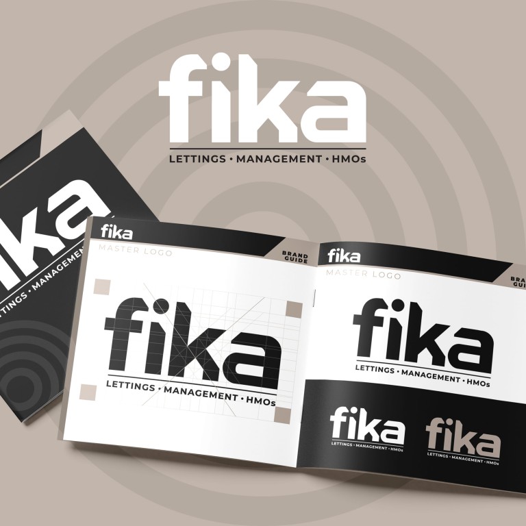
A lettings and property management company with a calm, confident personality, they needed a refreshed identity that had clarity and a strong presence while representing friendship and community - reflecting the Swedish ethos of the word. As we discussed direction and shared visual options the final version emerged from multiple presentations. We enlisted the help of one of our trusted brand designers, Joseph Crisp (website), who found the hidden house in the k - the key to the final logo!
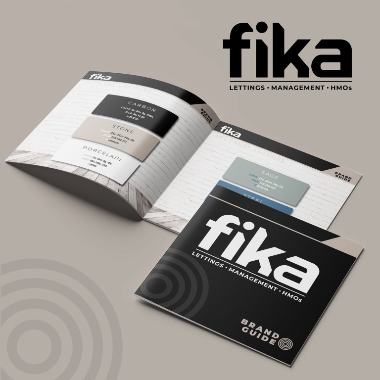
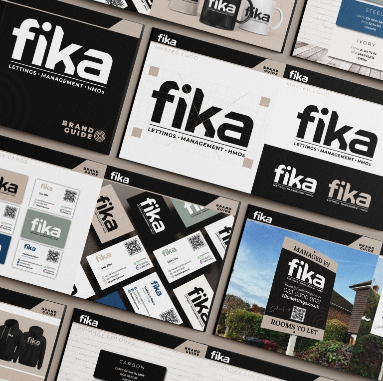
The logo sets the tone immediately — strong, architectural, balanced — the kind of logo that carries authority without ever feeling corporate. Its variations across light, dark and tonal colourways show how adaptable it is across signage, print and digital use. The colours do a lot of the storytelling. Carbon, Stone and Porcelain form a grounded neutral palette, supported by Sage, Steel and Ivory — shades that feel warm, trustworthy and distinctly Scandinavian. It’s a palette that invokes calm confidence. The typography brings structure and softness in equal measure, giving the brand a voice that feels both professional and approachable.
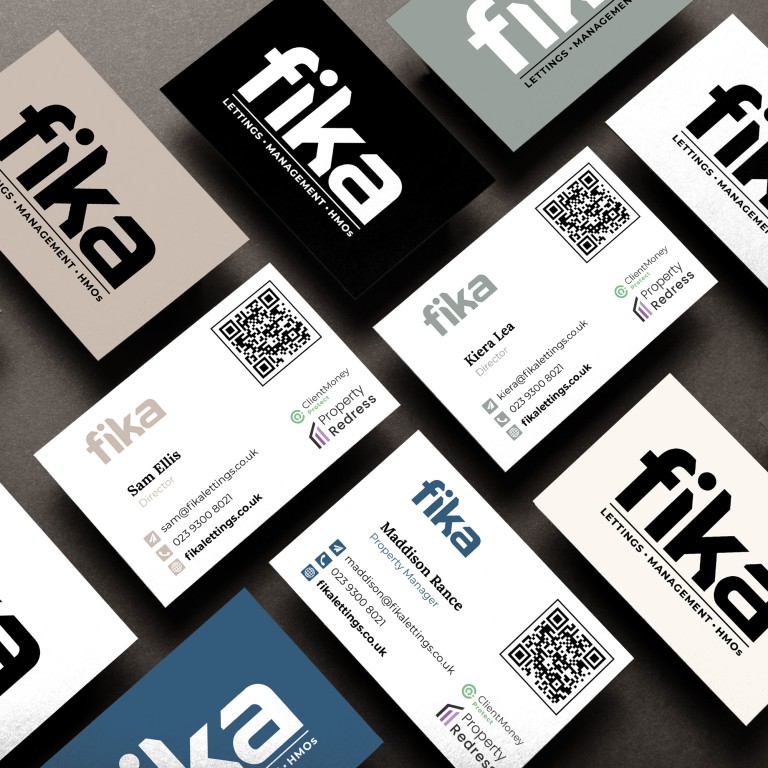
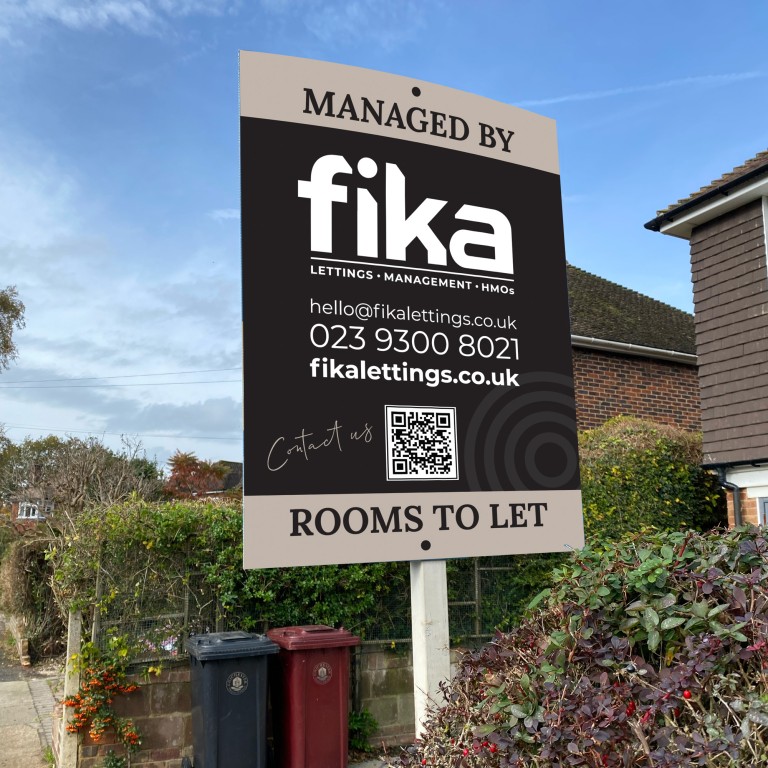
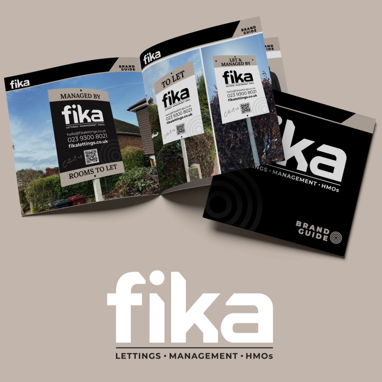
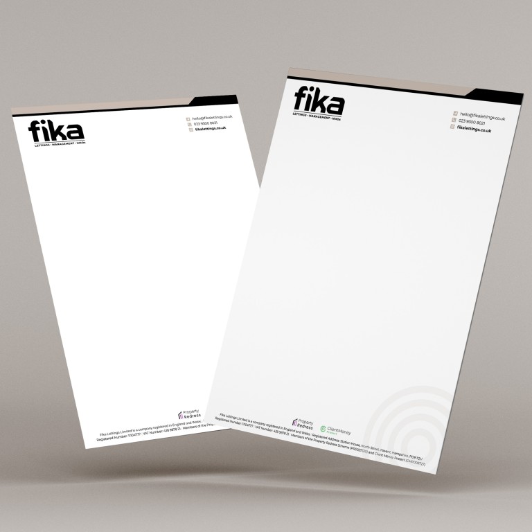
When we move into applying the logo — 'To Let' boards, letterheads, business cards and promotional items — you see the brand truly settle into itself. Clean layouts, subtle, soft, circular graphics, and consistent, quiet detailing all reinforce the same message: FIKA is dependable, thoughtful and there for you. What we’ve created isn’t just a visual identity; it’s a complete sense of how the business should feel every time someone interacts with it. A brand built to grow, to be recognised, and above all, to be trusted.
Do you need a brand refresh... Let's talk!
