We’ve recently had the pleasure of developing a brand identity for Black Oak Construction, a local firm who came to us looking for something clear, distinctive, and instantly recognisable — whether spotted on a van driving through town or on signage at a building site.
Black Oak wanted to stand out from the crowd and present a strong, unified image that would reinforce trust, professionalism, and attention to detail — the very qualities they bring to every job. We began, as we always do, by getting under the skin of the business: understanding their values, their audience, and the impression they wanted to make.
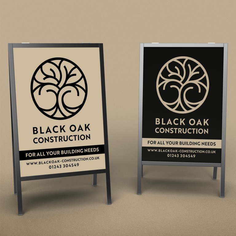
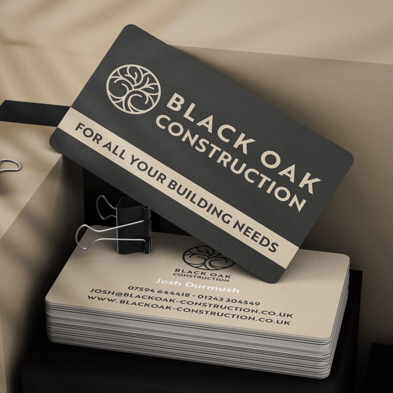
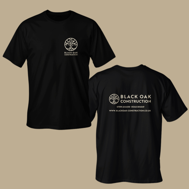
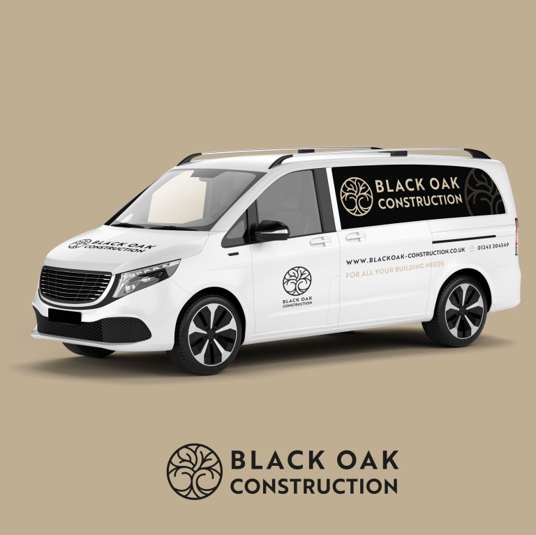
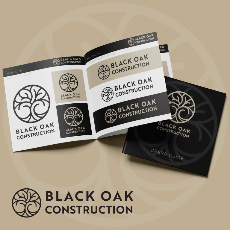
From there, we explored a range of creative concepts, each designed to reflect the confidence and craftsmanship at the heart of the business. The winning direction was a bold and simple graphic roundel — a logo that feels solid, practical, and rooted, just like their name suggests. It’s a design that scales beautifully across applications: striking on vehicle livery, clean and clear on signage, and adaptable for both print and digital use.
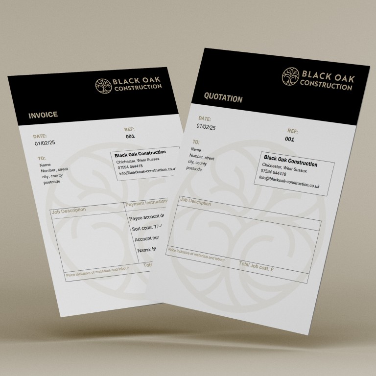
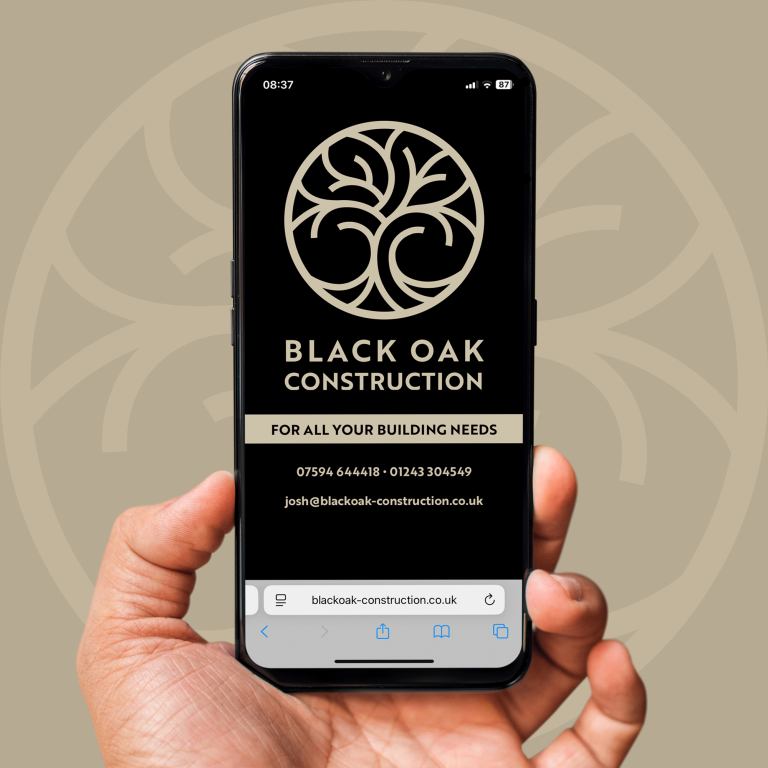
Alongside the brand mark, we developed a clean, no-nonsense visual identity system: strong typography, a simple, solid colour palette, and practical layouts that reflect the way Black Oak work — straightforward, reliable and well put together. We’ve applied the new look to stationery, business cards, on-site signage and van liveries. A new website is also in the works to help showcase their work and bring in new business.
This is exactly the kind of project we love — helping a growing local business take pride in their brand and show the world what they stand for. Black Oak Construction now have a cohesive, confident identity that supports them on every job, and will grow with them as their business grows.
If your own business brand could do with a solid foundation (or a complete rebuild), you know where we are. Let's talk!