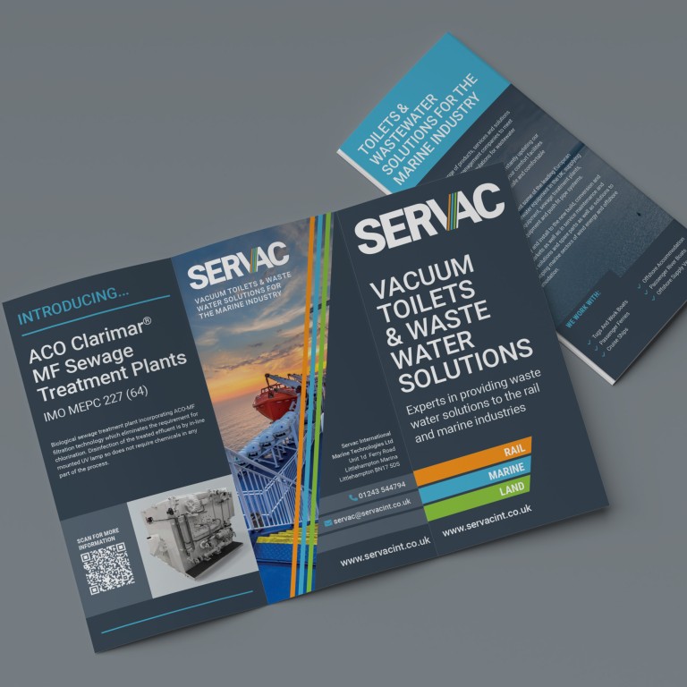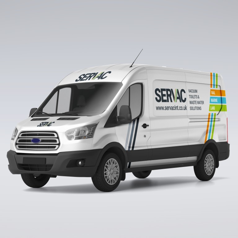
When Servac approached us for a complete rebrand, the brief was clear: create a bold and unified identity that represented the three core sectors they operate in – rail, marine, and land. Our response was a confident and contemporary visual language that brings clarity and cohesion across every customer touchpoint.
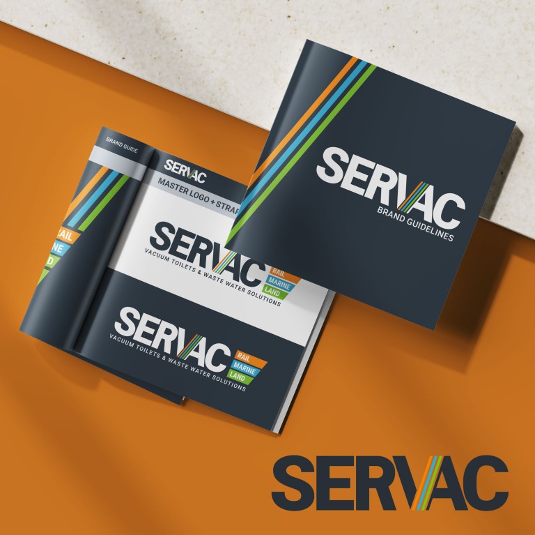
At the heart of the new brand lies a distinctive tri-colour device, introduced within the logo to symbolise each sector. This vibrant trio not only delivers instant sector recognition but also forms a visual framework that we’ve carried through to every element of their communications.
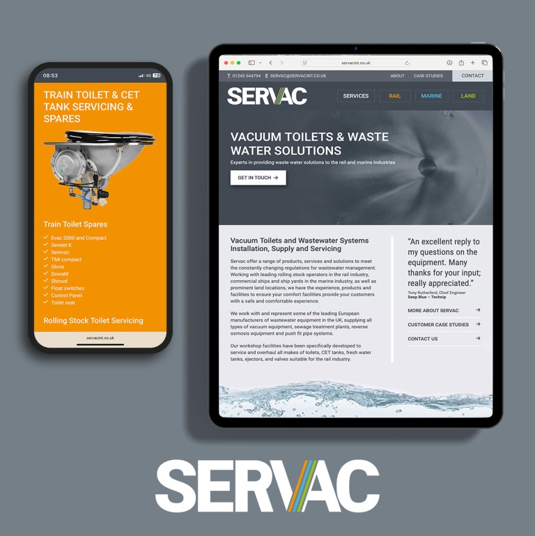
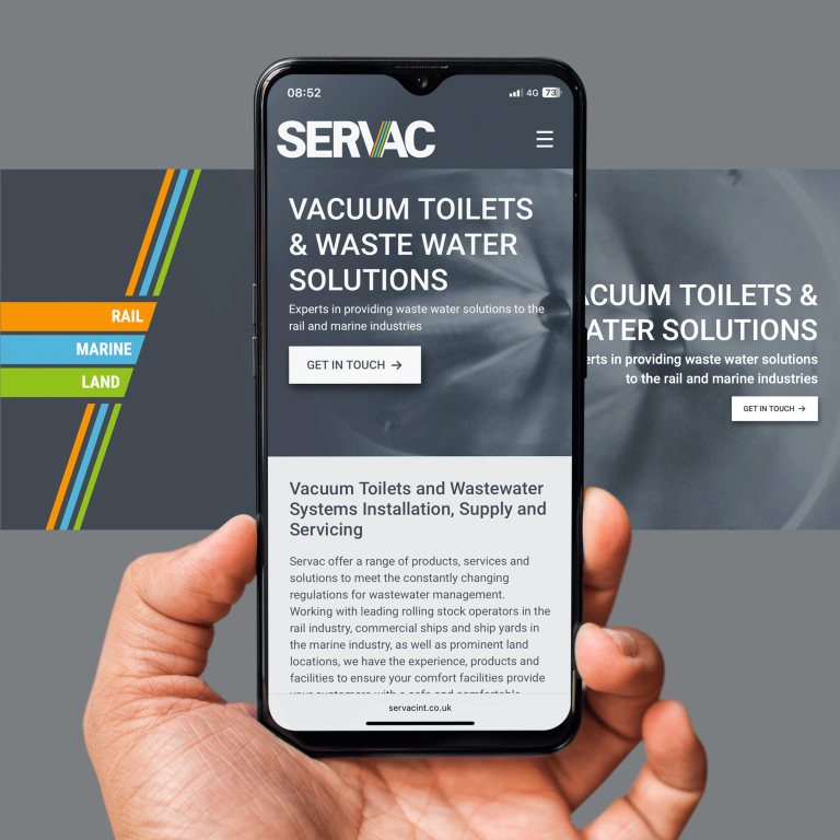
With the brand foundations in place, we turned our attention to Servac’s website. The new design features the tri-colour palette set against a sophisticated combination of dark and mid greys, allowing each sector to stand out with clarity and purpose. We adopted our proven mobile-first approach, ensuring a smooth, responsive user experience across all screen sizes – from smartphones to desktops. This isn’t just about great aesthetics; responsive design plays a crucial role in both user engagement and SEO performance.
The result? A sleek, modern platform that’s already been met with positive feedback from Servac’s client base. You can explore the new site for yourself here: servacint.co.uk
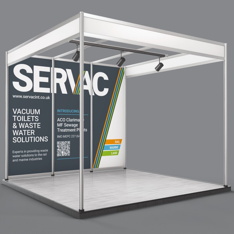
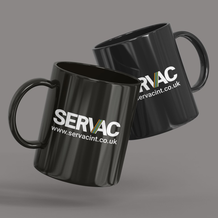
We have also rolled the brand out across a wide range of collateral – from stationery, vehicle livery and office signage to exhibition stands and promotional merchandise, including mugs, pens and tote bags. The new identity proves to be not only versatile but also impactful, reinforcing Servac’s professionalism and sector expertise wherever it appears.
This project exemplifies the way we blend strategic brand development with intelligent, user-focused web design – creating cohesive identities that work hard across both print and digital platforms for our clients.
So if you’re thinking about refreshing your brand or website, let’s talk.
