Every now and then a project comes along that reminds me just how long some of our client relationships actually go back.
I've been working with Serco on their Sandwell contract for more than 15 years, but our involvement actually started before there was a Sandwell contract to work on! I had supported the Serco Bid Team for many years and was part of the team that helped put together the original Sandwell bid. When Serco were subsequently awarded the 25-year contract we stayed involved, working with both the Serco and Sandwell communications teams.
We've been doing it ever since.
Over the years that's involved all sorts of different projects and campaigns, usually with the same basic purpose behind them: Sandwell Council and Serco have something they need to tell local residents, and our job is to help them find the clearest and most effective way of doing it.
Looking back, I suspect we've probably communicated rather more about bins, recycling, waste collections and rubbish than I ever imagined I would when I started my career as a graphic designer!
One of the larger campaigns we've worked on in recent years was the recycling campaign that ran across 2024 and 2025, and I think it's a good example of how a relatively simple idea can develop across lots of different types of communication without losing its identity.
Hands up if you recycle
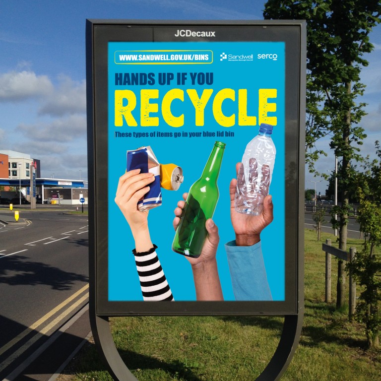
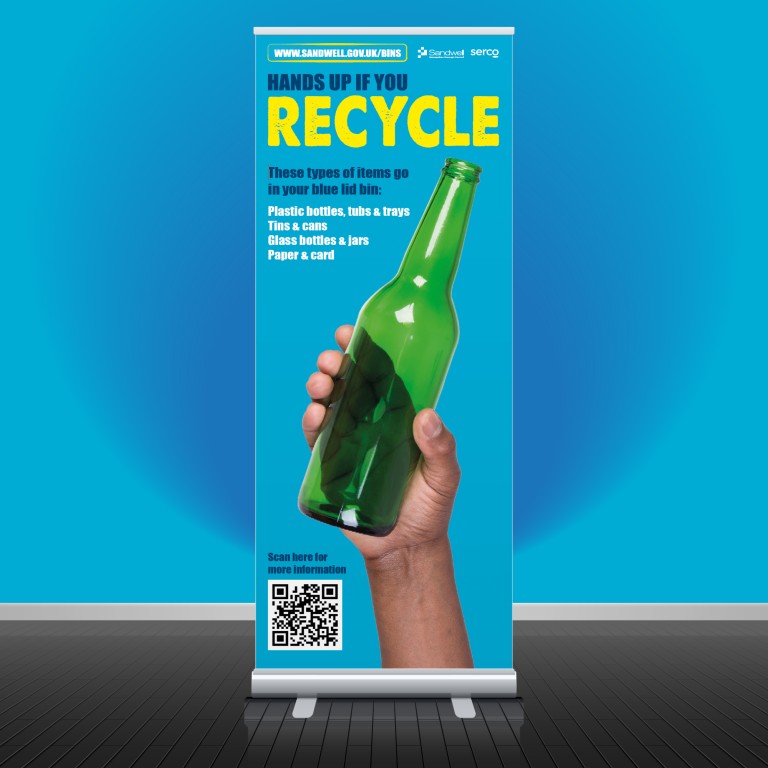
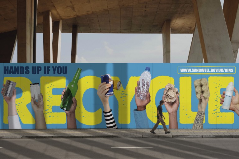
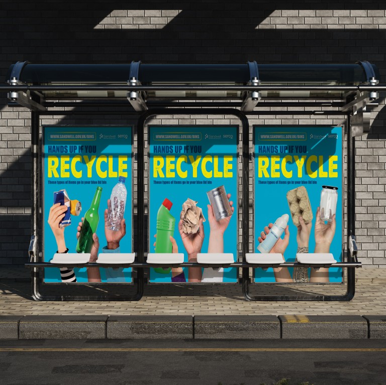
The central idea was HANDS UP IF YOU RECYCLE, with a collection of different hands holding the everyday things people can recycle. Bottles, cans, jars, paper, card and packaging all became part of the imagery, with the large yellow RECYCLE message making it pretty difficult to miss.
I liked the idea presented by the Comms Team from the beginning because it gave us something very simple that could be adapted in lots of different ways. That became important because this wasn't a campaign that was only ever going to appear in one place.
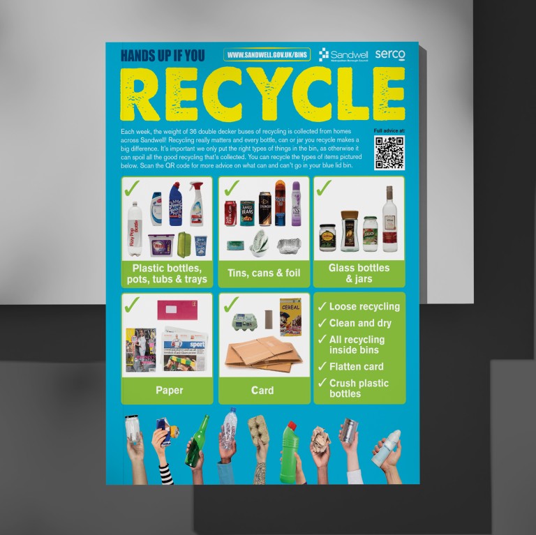
We developed the artwork across vehicle liveries, bus shelters and other street advertising, print advertising, social media graphics and information that went directly into residents' homes. The detailed material could explain what belonged in the blue lid bin and give practical advice about keeping recycling clean and dry, flattening card and crushing plastic bottles, while the outdoor advertising needed to communicate the same basic message much more quickly.
That difference is something I've always enjoyed about this sort of work because you can't simply design one piece of artwork and keep changing the dimensions.
Someone standing at a bus stop has a completely different relationship with the design from someone reading information that's arrived through their letterbox. The street advertising versions had to be understood almost instantly, so we could strip the message back to the big headline and a handful of familiar objects. On other versions there was enough room to explain that plastic bottles, tubs and trays, tins and cans, glass bottles and jars, paper and card could all go into the blue lid bin, with a QR code taking people to more information.
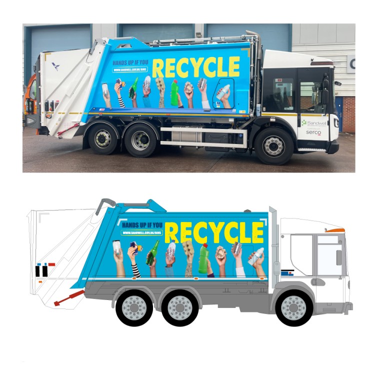
The vehicle livery presented another challenge altogether. Suddenly the artwork we'd been working on at normal size on screen was covering the side of a refuse collection vehicle and travelling around Sandwell every day.
Taking the recycling message across Sandwell
I've always liked vehicle graphics for exactly that reason. You're taking something that's essentially functional and turning it into a moving piece of communication. In this case it made perfect sense because the vehicles collecting the recycling were also carrying the message encouraging people to recycle properly.
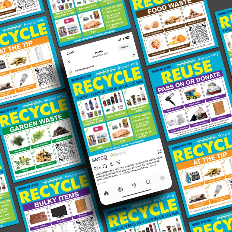
As the campaign developed we were able to use the same overall look for more specific messages too. Social media graphics covered the main recycling information as well as food waste, garden waste and the items residents could take to the tip. The subject changed, but visually it still belonged to the same campaign.
That's probably the part of this project I find most interesting when I look back at it now. It wasn't really about designing vehicle graphics, a poster, a social media graphic or a piece of direct mail. It was about creating something flexible enough to communicate the same idea wherever a Sandwell resident happened to encounter it.
And they might encounter it almost anywhere.
It could drive past them in the morning, be waiting at the bus stop later that day, appear on their phone that evening and then arrive through their letterbox.
Each time the amount of information might be different, but the colours, typography, hands and big RECYCLE message made it immediately part of the same conversation.
A relationship that started with the original Serco bid
There's another reason I wanted to write about this project, though, and that's the relationship behind it.
When I worked on that original Serco bid more than 15 years ago, I obviously had no idea that I'd still be sitting here all these years later working with the teams responsible for delivering the contract. In that time people have changed, communications have changed and the ways we reach residents have changed enormously, but we've remained part of the process.
I think that's one of the things I've come to value most about running a design business for as long as I have. You get to see relationships develop far beyond the first project. You learn how organisations work, you create relationships with the in-house teams, you understand the practical problems they're trying to solve and, eventually, there's a familiarity that means you're not starting from scratch every time a new brief lands. You're not just making something look nice at the end of the process; you're helping work out how the message should be communicated in the first place.
Perhaps that's why the original bid connection means more to me now than it probably did at the time. I helped Serco when they were trying to win a 25-year contract. More than 15 years later, I'm still helping them deliver it. And sometimes that means taking a fairly complicated subject like recycling and finding a way of making it simple enough to understand whether someone sees it on the side of a truck, at a bus stop, on their phone or on something that's just dropped through their letterbox.
Which, when you strip away all the terminology, is really what design has always been about. Getting the right message in front of the right people, in a way that gives it the best possible chance of being noticed and understood.